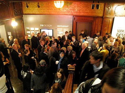
The massive crowd of designers and donors at the preview
I figured I should recap on a previous adventure closer to home before heading overseas. I had talked about the vault sighting at the Cooper-Hewitt, but the preview reception came and went as a milestone in MIT MRG's book (Masonry Research Group - yeah, we came up with a name instead of perpetually calling ourselves "the Team").
As I mentioned before, the group had been working on this project since last spring, so I was really looking forward to actually seeing the vault in person. Walking into the CH that night of the 13th was a surreal experience. Not everyone on the team could make it, which was a shame, but it was still a very festive (and cacophonous) night. The museum was absolutely PACKED. It's moments like these when I truly lament being short, since most people's armpits are at my nose level and it's difficult to get people to notice that I'm trying to push past without jabbing them in the ribs with some generous elbow movements.
And then,
A little walk-through leading up to :
Perhaps the other photos look better, but somehow this is special because I took it in person. The vault in all her arching splendor! So unassuming and light yet heavy with the hours of work involved in getting those catenaries just right and the bricks laid with minimal mortar wasted.
This vault need not go on a diet - she's so thin already!
And of course, you can't leave without taking at least one (or more...) silly pictures, here with Flo as my partner-in-crime. No worries, though - the vault can't be destroyed with a mere push by a small one like me. You need a couple sledgehammers and many minutes of sweat to make the footings budge.
One of the most surreal aspects of the event was seeing our names on the wall plaque, and then going around the exhibition and seeing other well-known names we also recognized: MVRDV, FOA, KTA, Norman Foster... and MIT MRG. Although it was cool sitting virtually side by side with these architects and their firms, one major difference stood out: most of them had renderings, models, or other forms of representation for their buildings, whereas we had a full scale installation. KTA did have a massive wall section of their Loblolly house there, which was cool to see, but I would have expected more 1:1 mockups or at least larger scaled prototypes than the typical renderings you would see in a magazine or monograph.
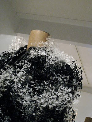
There are too many other cool projects within the overall "Why Design Now?" exhibition, but one that I thought was semi-insane yet admirably intricate was this sweater:
Look closely. Yes, it's made from those little plastic tags retailers use to attach price tags to clothing. Now that's what I call attention to detail in reuse before recycling.


No comments:
Post a Comment